So, if you'll remember, I had been inspired by Bety's Floridian images to weave something with those glorious blues and greens. I fiddled around with various rearrangements of blues and greens and off-white stripes with my cones of 8/2 cotton, but I just couldn't come up with anything. Lesson #1: Apparently, I can't think if I'm sick with a sinus infection/allergies/toothache that various medical professionals hadn't quite treated successfully. The sinus infection is mostly gone (that's what really made it impossible to think), the allergies are about as under control as they ever are, and the toothache - well, it comes and goes, as it has for the past decade, without enough specificity of location for the dentist to do anything about it. Lesson #1A: Keep going back if the doctors haven't quite gotten something licked. I tend to Just Endure, but I need to pester in my own defense. The last office visit resulted in a quadrupling of nasal spray #1, with a certain schedule of application, and a lengthening and increased complexity of antibiotic - and I think it's done the trick.
In the midst of infected mindlessness, all I could do was wind a warp of good ordinary blue, with accent dimity stripes of pale, silvery green. That was it. No complex, shifting, evocative combinations of blues/greens with a smudge of violet, sparked by raised dimity stripes in color counterpoint, all suggesting a sun-drenched, humid Florida summer day about to be cooled off by a rocking thunderstorm. Um, no. Not with a brain sat upon by an overweening sinus or twelve.
Blue. I could cope with blue. Luckily, the cone of pale, silvery green was on top of the blue cone, so I could be smacked in my mindlessness with how great the pale green was with the deep blue.
3.5 yards long, by 9 or so inches wide. I figured I could sew myself a lunch bag out of it. I got the warp on the loom with no mistakes, by some miracle, and started weaving. I used 16/2 cotton, because the dimity article guiding me, from the November/December 2008 issue of Handwoven, specified that the weft should be half the heft of the warp. And here it was...
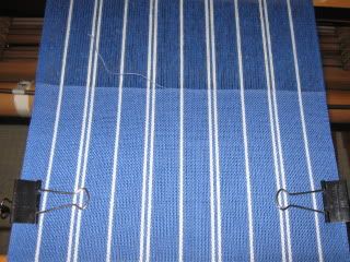
It was working. By this point, the super-duper antibiotics and nasal sprays were beginning to do their job, because I started to get a little bored. And I started to notice something.
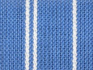
Does that look a little sleazy to you? Let me hold up a sheet of paper behind the cloth...
That's a lot of white showing there. I was worried this wouldn't work, that it wouldn't be sturdy enough for a simple lunch bag, and I couldn't figure out why. I rechecked the Handwoven article, the recommended sett for 8/2 cotton, the size reed I was using - everything I could think of. I could not figure out what I was doing wrong.
Lesson #2: Do not beat yourself up when you can't think straight when you are sick. It is not helpful.
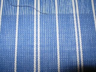
Eventually, it dawned on me that the instructions in the Handwoven article were for dimity scarves. You know, those drapy, flowing pieces of cloth that aren't all that suitable for sturdy lunch bags? Sigh .... By that time, I had woven one bobbin's worth of the 16/2 cotton, and I switched to a turquoise 8/2 cotton for the next bobbin.
Now we were cooking! Here's the point of change. You can see the breast beam through the 16/2 weft, but not through the 8/2 weft.
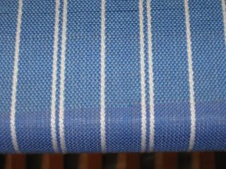
A couple of bobbins' worth of 8/2 - maybe a yard or so - and I got bored again. I started throwing a shot of heavy, textured cotton in every 4th pick, and I liked the simple balance between the silvery warp stripes and the dark, slubby weft stripes. I finished up the warp with this combination.
A quick wash, dry, and iron, and this is the result.
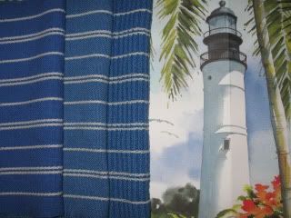
From left to right, the same 8/2 warp with a 16/2 weft, an 8/2 weft, and the same 8/2 weft with shots of slubby cotton, along with one of Bety's images. The two heavier fabrics are indeed just fine for sewing into a lunch bag (or two), but interestingly, the lighter fabric is not sleazy at all. It's really a lovely, drapy fabric, just right for a cotton summer scarf or shawl.
In fact, I'm planning just such a shawl, in that same lovely blue and silvery pale green. I'd like to figure out how I can convey the rounded cloud shapes in some sort of lace along with the dimity stripes - maybe hand-manipulated Danish medallions, I'm not sure. Since I'll be away this coming weekend, I won't be weaving the shawl before the end of this challenge.
Lesson #3: Try something, and then variations on that something. Just keep trying.
I suppose I didn't accomplish that much with this challenge, certainly not compared to others, but I did what I could. Lesson #4: Learn to live with being imperfect.
8 comments :
Oh those lessons. Not sure I know how to learn THOSE. But I do like your experiment. My first reaction to this post: huh. weaving. But it was interesting! I liked your science, even if it was stuffy sinus science. (say that fast five times?)
Being naive of weaving, I thought the "sleazy" shot looked just fine!
Very nice fo!
It makes me feel like I'm sitting at the beach!
I swear, the best part about this challenge was that you got bored. I mean, you sampled a lot and now have different ideas with different wefts. If you liked the first weft, you might have gotten just the one scarf and that would have been the end.
So three cheers for getting bored and have a lovely time away!
And please let me know if you post something else based on this - I'll be sure to let folks know.
I like the simplicity of your translation of the lighthouse to a blue and white stripe. It makes me wish I had not been so literal in my own translation.
Love the weaving! Very classy interpretation of the lighthouse theme.
Learning that you need to keep going back to the doctor until something is fixed is an important lesson. Medicine is an art as well as a science, and your doctor needs to know something hasn't worked so he/she can try something else.
i really enjoyed reading about the whole process for you. the weaving paired with the photo has a real freshness to it!
Post a Comment